NowTV
NowTV is a Hong Kong IPTV provider. In 2010 with the rise of smartphones and tablets, it began extending the TV experience from set-top box to the smaller mobile screens. Now Player was then a new mobile app to deliver the cross-device ‘second screen’ experience for its subscribers.
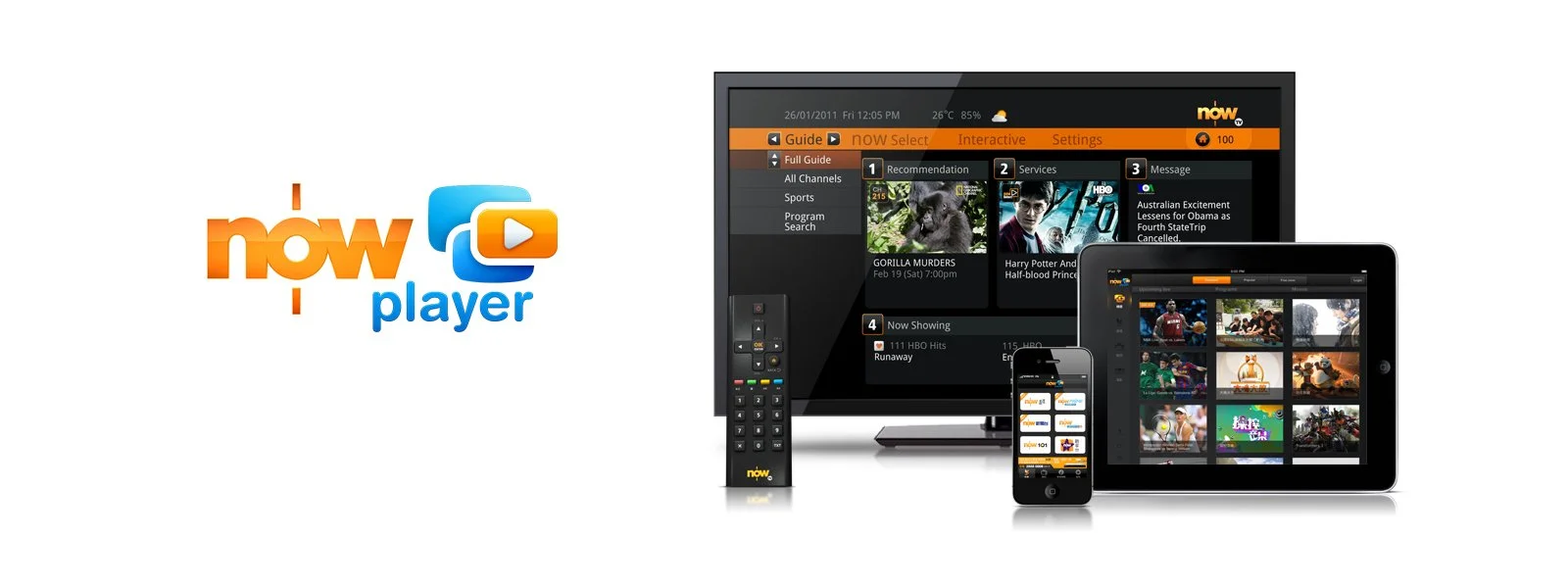
Cross-device TV experience
As the first step to extend the TV experience onto mobile screens, the project objective was clear that is providing an equivalent experience, with equivalent catalogue of contents and equivalent functionality across devices. The benchmark of user experience are simple, consistent, engaging.
Like most other adaptation products back in 2010, the design was focus on adapting the user interface to gestural on a touch screen, with additional features like social sharing and some basic personalisation. Then of course, the first things to look at are the personas, their user journeys, goals, needs, and how they should be prioritised and fulfilled through the design of the final product.
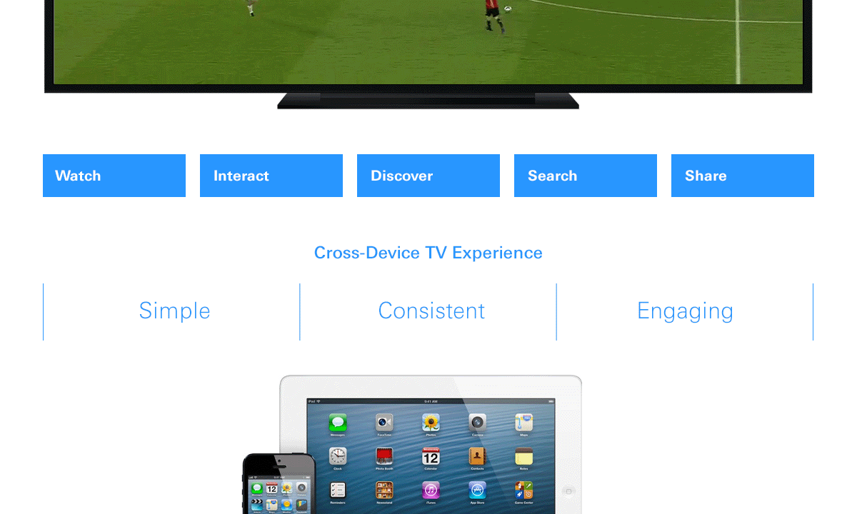
Same users. Experience redesigned.
By laying out the user journeys, there are a lot of similarities can be found around the user needs and actions. Differences were mostly based on the varied contents user intended to watch, and under the related contexts, e.g. watching live sports, watching romantic comedy on a Saturday evening, or binge-watching a drama series — the needs for specific functionality comes from the content & contexts.
Designing process set focus to deliver an experience adaptive to the mobile device, and in certain sense the interactions ‘liberated’ from the remote control, with least limitations from the ‘cursor’& button clicks, or the set-top box’s slow response. In a relatively smaller screen, it now allows more simultaneous interactions, info in a redesigned experience yet with consistences to the large screen.
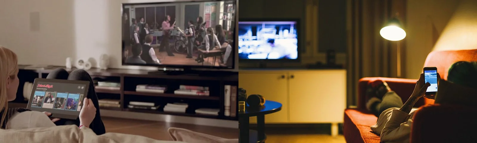
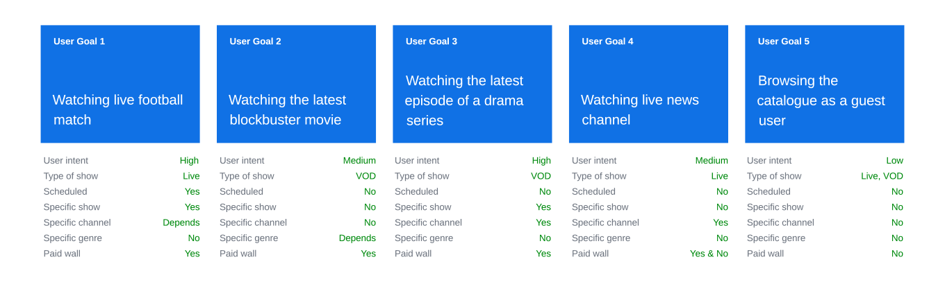
Fitting into the screen — contents & contexts
Watching the show is always the ultimate goal in any user journey. That instantly means delivering the best TV experience is about maximising the enjoyment of watching by minimising the threshold of any other user tasks such as browsing, searching, discovering, or in order words facilitating these user tasks as most effectively as possible.
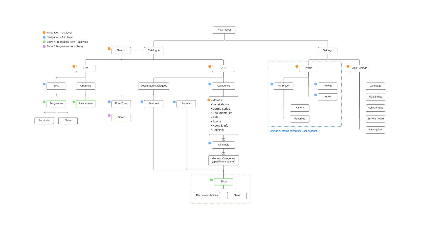
Catalogue is the tool users find the content they want. Therefore the groupings of the contents are crucial for a great user experience, the navigation design then rise above from it. Information architecture when done detailed and precise, provided an understanding of the structure of information, and naturally the hints for an effective interface design.
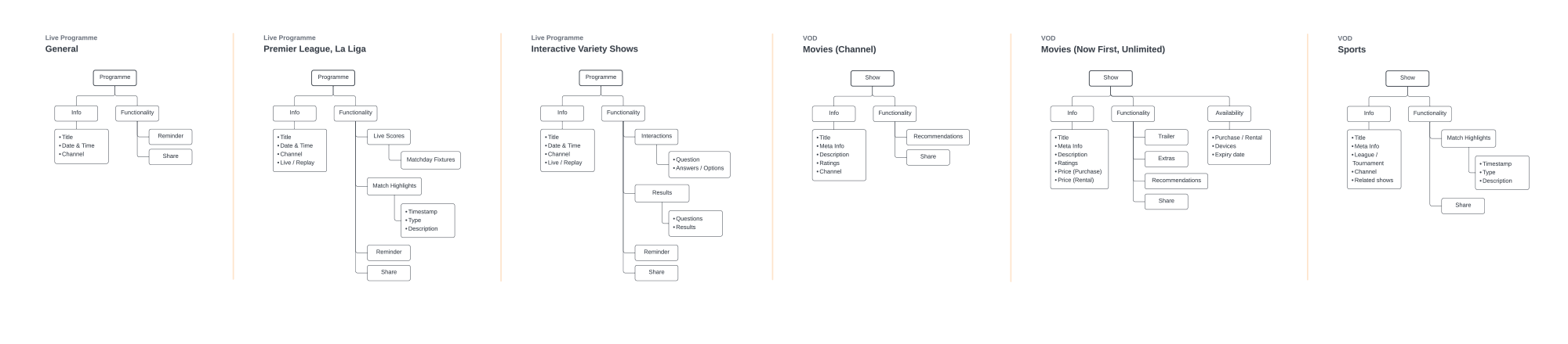
Each type of content has its varied structure, also because of the differences in contexts, it required interface specific to its use. For example, the real-time scores and highlights related to a live football match compliment the excitement; specials and extras complete the drama series binge watching. These were clearly laid out from the information architecture.
Information architecture
Focus on watching
Less is more. Great design is translucent — always set the stage for the contents, interface is just a ‘distraction’ — it was certainly a prime case for Now Player.
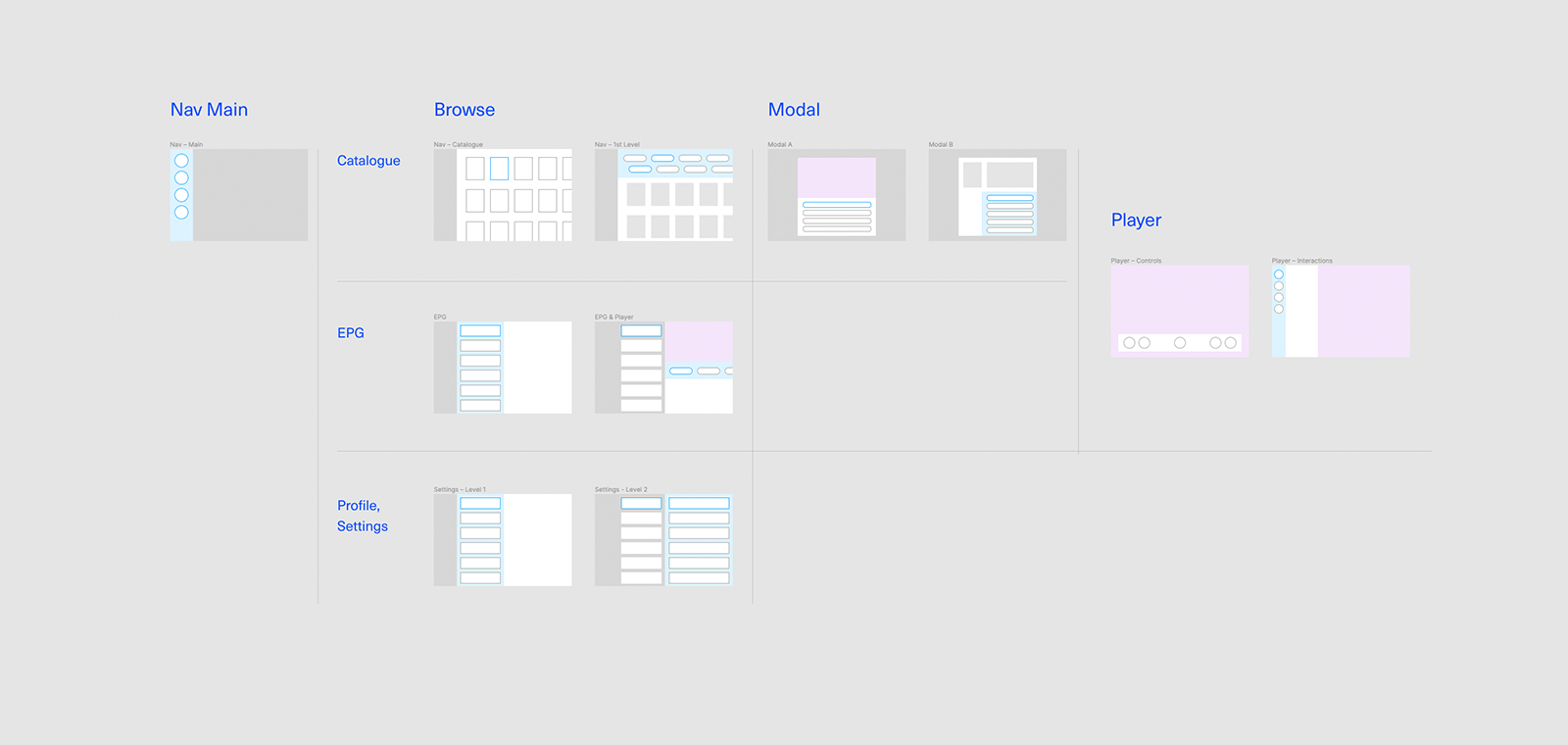
One rationale for this design was to minimise user’s learning curve. The interface should be so intuitive that it needs no tutorial or step-by-step walk through. The entire Now Player app is limited to least ‘modes’ possible to accommodate all variety of contents and interactions, so that the cognitive energy including memory and the ‘where-am-I’ is kept minimal.
Another rationale for the design was to confine the navigation within three levels for a user to start watching any show. It was eligible for both tablet and smartphone versions.
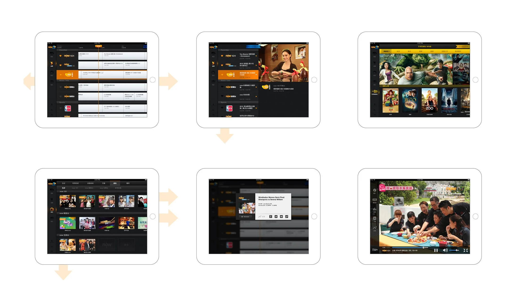
The design outcome was indeed very simple, yet adequate to serve all the user tasks. Below are shown the ‘modes’ of interface that Now Player all needed.
Artefacts
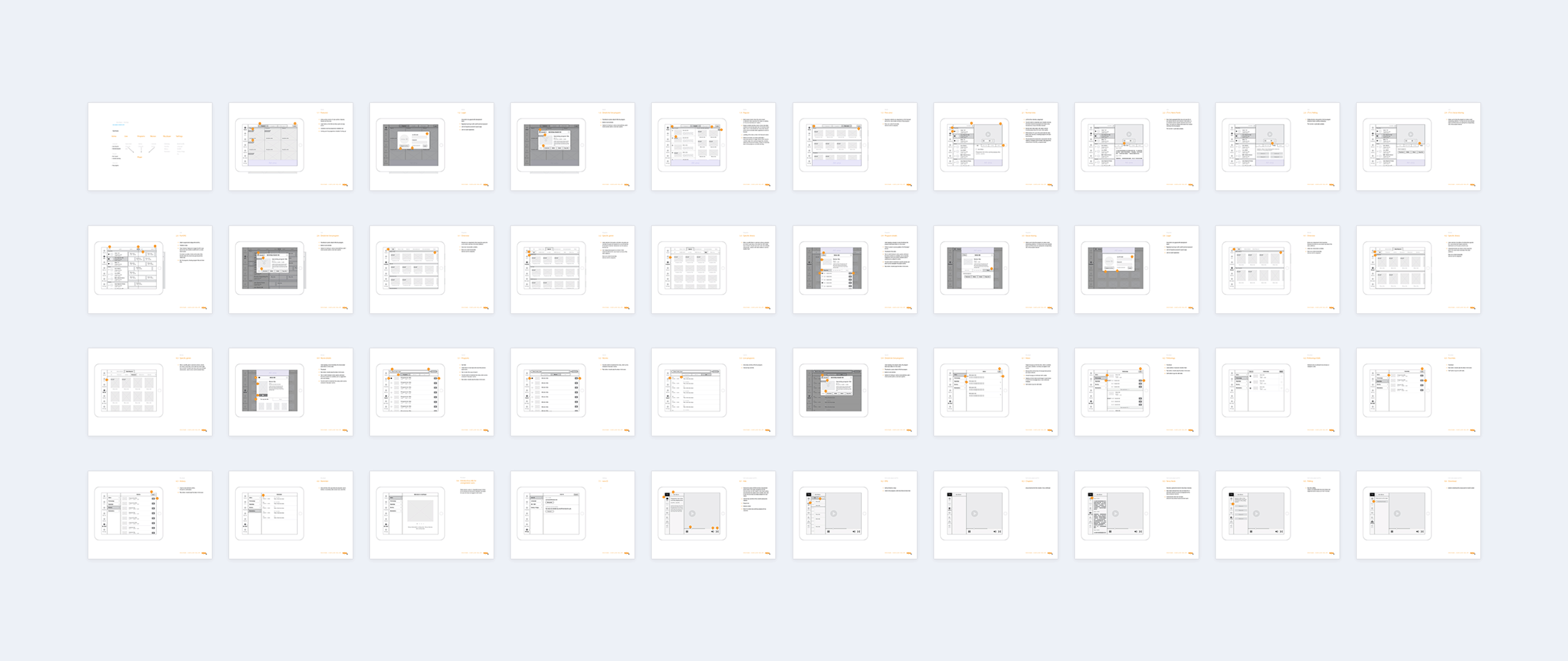
Wireframes (excerpt) to validate the tablet version interface design across various user tasks, contents, functionality.
Key screens
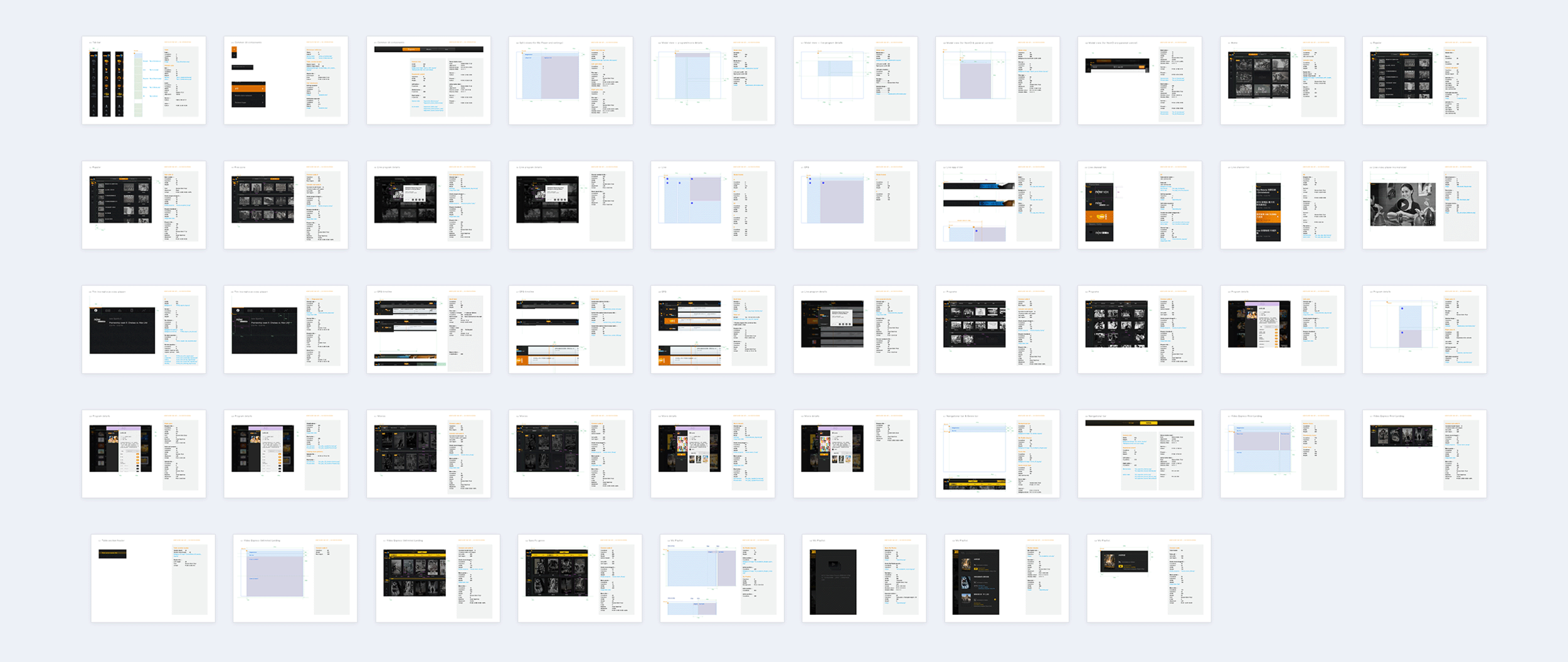
Design specifications
Tablet version (excerpt)
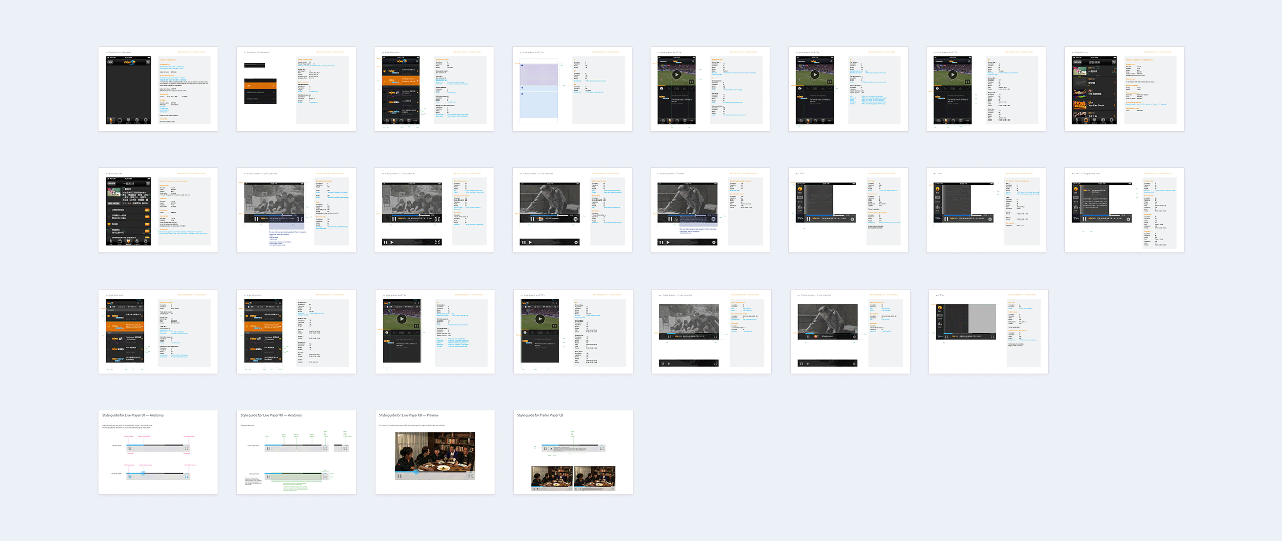
Design specifications
Smartphone version (excerpt)
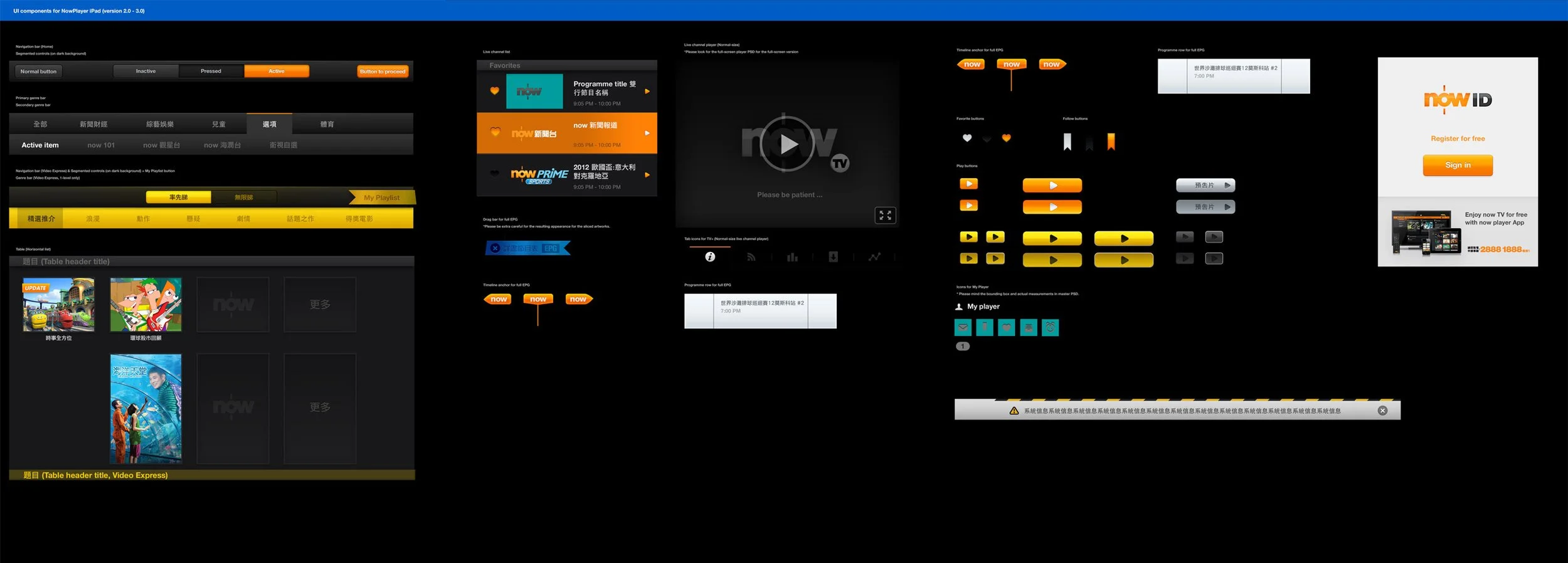
Design system
Yes it could have been more comprehensive and atomic.
Appendix
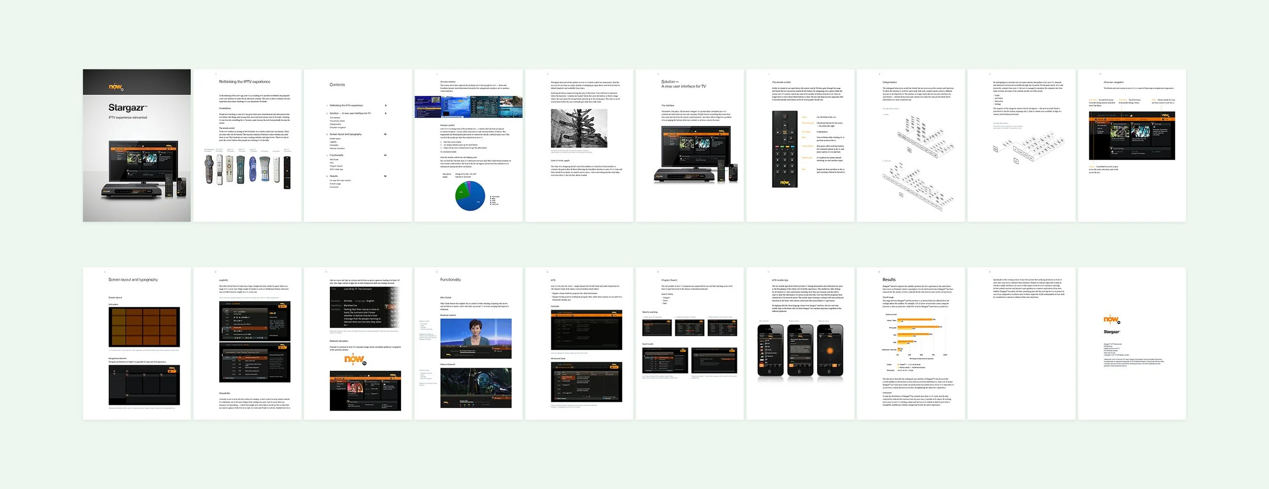
Design report on the then new set-top box interface. A summarised explanatory on the redesigned navigation and remote control.
(Responsible for formulating the report only. I did not participate in designing the Stargazr or hereby claim credit for it.)